Audit-Ready AI System Diagrams from Security Docs in Under an Hour
Build audit-ready AI data flow and control diagrams from existing security docs in under an hour using a repeatable workflow.
By Casey
Turn existing security text into audit-ready AI system diagrams fast
Security and compliance teams already maintain a surprising amount of “diagram material” in plain text: SOC 2 narratives, data inventories, vendor risk notes, incident runbooks, IAM standards, and internal policies. The problem isn’t lack of documentation—it’s that auditors and reviewers still want a visual story: where data flows, where it’s stored, and which controls apply at each step.
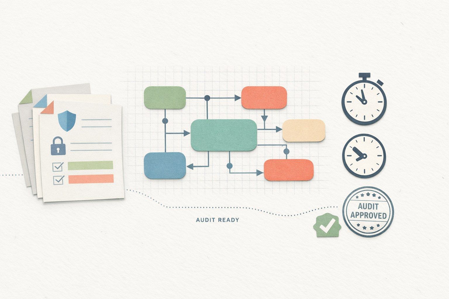
This workflow shows how to go from security docs to two audit-friendly visuals—(1) a data flow diagram and (2) a controls overlay—without starting from a blank canvas. With a structured extraction pass and a repeatable diagram template, it’s realistic to produce first-pass diagrams in under an hour, then iterate with stakeholders.
What “audit-ready” diagrams need to show
Auditors typically look for clarity more than artistry. A diagram is “audit-ready” when it is:
- Traceable: each system and flow maps back to a written source (policy, inventory, standard, or procedure).
- Bounded: includes an explicit scope (which product, which environment, which time period).
- Control-aware: highlights where key controls are enforced (authN/authZ, encryption, logging, key management, retention).
- Unambiguous: names match what’s in your inventory and what engineers call the services.
In practice, you’ll create two layers: a “pure” data flow view and a “controls” view. Keeping them separate avoids clutter while still letting you prove you understand risk and mitigations.
Inputs you can reuse from existing security docs
You can build diagrams from documents you likely already have:
- System descriptions from SOC 2 / ISO narratives
- Data classification and data inventory spreadsheets
- Access control/IAM standards and onboarding/offboarding procedures
- Logging/monitoring standards and alerting runbooks
- Vendor lists and DPAs (which sub-processors touch which data)
- Incident response plan and evidence of tabletop exercises
The trick is to extract diagram-friendly facts in a consistent structure, then feed that structure into a text-to-visual tool so you can iterate quickly.
The under-an-hour workflow
1) Define the scope in one paragraph
Start by writing a short scope statement that you’ll reuse in the diagram footer or legend. Include:
- Product or service boundary (e.g., “Customer support assistant in production”)
- Primary environments (prod only, or prod + staging)
- Data types (PII, customer content, usage analytics, payment metadata)
- Exclusions (e.g., “Salesforce reporting pipelines excluded”)
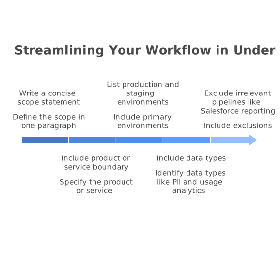
This prevents diagram creep and reduces rework during reviews.
2) Extract entities and flows into a compact table
Take 10–15 minutes to build a simple extraction table. You can do this in a doc, sheet, or note. Use columns like:
- Actor (User, Admin, Support, External system)
- Component (Web app, API, vector DB, LLM provider, logging pipeline)
- Data in/out (what is sent, what is returned)
- Purpose (why the transfer happens)
- Trust boundary (internal, third-party, customer environment)
Don’t chase perfection. You’re creating a first-pass map that can be validated.
3) Add a controls overlay list (control-to-component mapping)
Now list the controls that matter for the system and map them to components. Keep it tight and audit-relevant:
- Authentication: SSO, MFA requirements, session timeouts
- Authorization: RBAC/ABAC, least privilege, admin approval flows
- Encryption: in transit (TLS), at rest (KMS-managed keys), secrets handling
- Logging and monitoring: audit logs, retention, alerting, on-call procedures
- Data retention: deletion SLAs, backups, legal hold considerations
- Vendor controls: DPAs, subprocessors, regional processing constraints
If your org has specific control IDs (SOC 2 CC-series, ISO 27001 Annex A, internal control numbers), include them. That makes later evidence linking much easier.
4) Generate the first diagram from text and standardize the notation
Once you have structured text, generate a diagram draft and normalize the visuals so reviewers can read it quickly. A tool like napkin.ai is useful here because it acts as a text-to-visual translator: you provide the extracted components and flows, then refine layout and labeling without having to “design” from scratch.
Standardization tips that reduce audit friction:
- Use consistent shapes (services, data stores, external vendors)
- Label arrows with data type (e.g., “PII + prompt content”)
- Mark trust boundaries explicitly (internal vs third-party)
- Include a legend for acronyms and data classifications
5) Create a controls diagram as a second view, not extra clutter
Instead of squeezing everything into one picture, duplicate the data flow diagram and add control callouts. For example:
- Callout on API gateway: “mTLS + WAF + rate limiting”
- Callout on auth service: “SSO + MFA enforced for admins”
- Callout on storage: “AES-256 at rest, keys in KMS, rotation policy”
- Callout on logging: “Centralized audit logs, retention 12 months, alerting”
This two-view approach helps different audiences: engineers validate the flows; auditors validate the controls.
6) Add traceability hooks for future evidence requests
Audits rarely end with “nice diagram.” They lead to follow-up questions. Add traceability hooks now:
- A diagram footer with version, owner, and last reviewed date
- Component names that match your CMDB/inventory
- Control IDs in callouts (or a separate control mapping table)
If you already use observability to prove what actually happens in production, consider pairing diagrams with trace examples. For teams moving from ad hoc scheduling to observable workflows, the discipline described in migrating cron sprawl to code-defined DAGs with OpenTelemetry traceability can make “diagram vs reality” drift easier to catch.
Common pitfalls and how to avoid them
Confusing “where data can go” with “where it does go”
Security docs often describe capabilities. Auditors care about actual processing paths. Label optional paths as optional, and keep the default path prominent.
Unclear boundaries for third-party AI providers
When LLMs, vector databases, or managed inference services are involved, explicitly show whether prompts and retrieved context leave your boundary, and whether data is stored for model improvement. If your policies state “no training,” put that in the controls view.
Over-indexing on perfect diagrams instead of review loops
The fastest way to correctness is a short review loop. Treat the first output as a draft, then validate with Security, Eng, and whoever owns vendor relationships. A lightweight feedback workflow (clear owner, deduping, and routing) prevents diagram edits from turning into an untracked backlog—an approach similar in spirit to a feedback triage playbook for deduping and routing product requests.
A repeatable deliverable set auditors understand
By the end of the hour, aim to have:
- A data flow diagram with labeled components, data types, and trust boundaries
- A controls overlay diagram mapping key controls to the same components
- A short mapping note (one page) listing sources used (policies, inventories, runbooks)
This package is usually enough to anchor early audit conversations and reduce time spent translating narrative text into visual evidence—especially for AI systems where data movement and control placement matter as much as the model itself.