State Machine UI Pattern for No-Code Apps That Scale Multi-Step Journeys
A practical State Machine UI approach to model onboarding, approvals, and renewals cleanly in no-code apps.
By Casey
Why multi-step journeys collapse into workflow spaghetti
Most no-code apps eventually outgrow the “page-per-step” mindset. Onboarding turns into a maze of conditional screens, approvals become a patchwork of hidden fields and status flags, and renewals mix scheduled jobs with UI hacks. The result is usually the same: logic scattered across front-end conditions, database triggers, and automations that are hard to test and even harder to change.
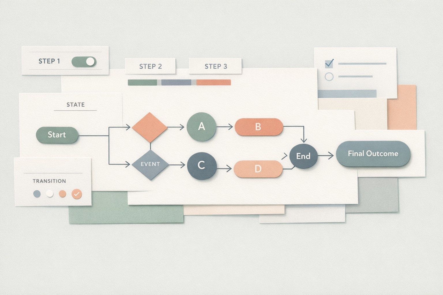
The “State Machine UI” pattern is a practical way to model these journeys as explicit states and transitions. Instead of representing the user’s progress as a set of loosely related booleans (e.g., hasCompletedStep2, isApproved, needsReview), you maintain a single, authoritative state and a defined list of allowed transitions. In the UI, that state becomes the routing layer for what the user can see and do next.
What a state machine means in a no-code UI
A state machine is a model where:
- States describe where a record or user currently is (e.g., Draft, Submitted, Under Review, Approved).
- Events are actions that may change state (e.g., submit, request_changes, approve).
- Transitions define which event can move you from one state to another.
- Guards are conditions that must be true for a transition to be allowed (e.g., “all required docs uploaded”).
- Effects are side effects triggered by a transition (e.g., send an email, create tasks, schedule renewal reminders).
In no-code environments, you don’t necessarily implement a classical library. You implement the concept: one state field, a transition map, and UI components that render from those rules.
The core building blocks
1) A single “state” field
Start by choosing one canonical field that represents the journey stage. This should be stored on the entity that “owns” the journey: a User for onboarding, an Application for approvals, or a Subscription/Contract for renewals. Use a constrained set of values (enum-like): avoid free-text states.
Rule of thumb: if you ever need two fields to understand “where the user is,” you are already drifting away from the pattern.
2) A transition table you can read
Define transitions in a structured way, even if it’s just a simple table in your documentation or a JSON-like configuration in your backend:
- From state → Event → To state
- Optional guard conditions
- Optional side effects
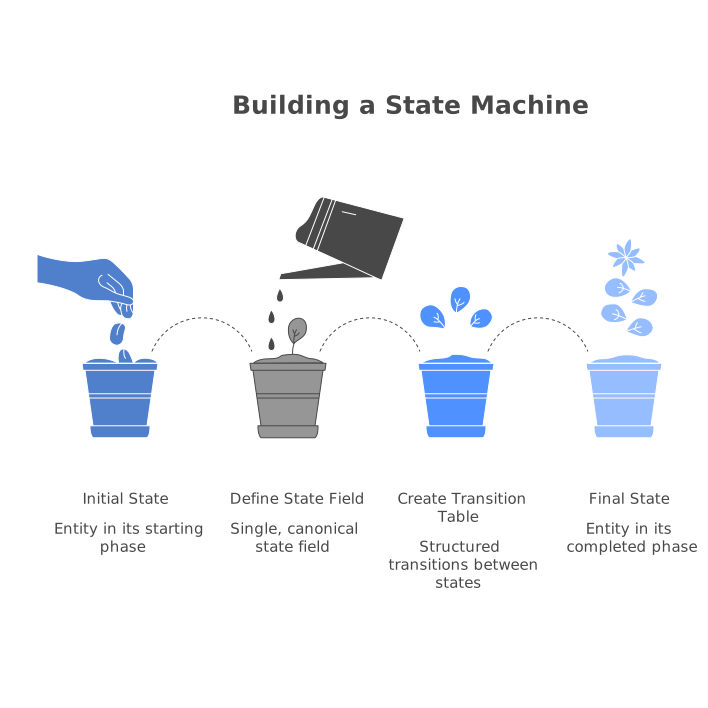
This transition map is the antidote to “workflow spaghetti” because it makes invalid moves explicit. It also gives you an immediate checklist for testing.
3) A UI router driven by state
Once state is authoritative, the UI stops guessing. Instead of many nested “if” blocks across pages, you build a small state-aware routing layer:
- Each page (or major component) declares which states it supports.
- On load, you fetch the current state and redirect/render accordingly.
- Buttons are rendered only for transitions allowed from that state (and permitted by role).
This is where a visual platform helps: you can express the rules as clear conditions, but the rules come from the state machine rather than being invented ad hoc per screen. In weweb.io, teams often implement this with a combination of dynamic pages, conditional containers, and API-driven updates to the state, keeping the visual layer clean while still supporting branching logic.
Modeling three common journeys
Onboarding with branching paths
A typical onboarding might include identity verification, workspace setup, and permissions. Branching happens when a user is an admin vs. a member, or when verification fails.
Example states:
- onboarding_started
- profile_complete
- verification_pending
- verification_failed
- workspace_configured
- onboarding_done
Key practice: don’t model “steps” as UI pages. Model them as business outcomes. “Profile complete” is stable; “Step 2 screen” is not. This makes it safe to redesign the UI later without re-writing your logic.
Approvals with roles and rework loops
Approval flows break when rework loops aren’t explicit. If “changes requested” is just a checkbox, you end up with records that are both “submitted” and “needs edits.” A state machine makes rework a first-class path.
Example states:
- draft → submitted → under_review
- changes_requested → back to draft (or resubmitted)
- approved / rejected
Guards enforce data completeness at the moment it matters: “submit” requires required fields; “approve” requires reviewer role. Effects handle notifications and audit entries. If you also run a feedback pipeline around these flows, it’s worth ensuring your approval states remain consistent with how you deduplicate and route requests; otherwise, you’ll misread what’s blocked vs. what’s simply noisy. (Related: Feedback Triage Playbook for Deduping and Routing Product Requests.)
Renewals with time-based transitions
Renewals add a time dimension: “active” is not enough; you need states like “renewal upcoming,” “in grace period,” or “expired.” Many teams bolt this onto cron jobs and email automations, which is where the journey becomes fragile.
Example states:
- active
- renewal_due
- renewal_in_progress
- grace_period
- expired
Time-based transitions (e.g., moving to renewal_due 30 days before end date) should still be expressed as state transitions, even if triggered by a scheduler. That keeps your UI aligned with what automation is doing and lets support teams understand the customer’s situation instantly. If you’re consolidating many scheduled tasks, a structured DAG approach can keep observability intact while still preserving your state model. (Related: Migrating Cron Sprawl to Code-Defined DAGs With OpenTelemetry Traceability.)
Implementation tips that keep the pattern clean
Make transitions the only way state changes
A common failure mode is allowing ad hoc edits: someone updates the state field directly “just to fix it.” Instead, funnel state updates through named transition actions (API endpoint, backend function, or automation step) so you can enforce guards and log the event.
Separate “state” from “status metadata”
Keep the primary state minimal. Store supporting information separately: timestamps, reviewer ID, last email sent, verification provider response. This avoids state explosion (where you create a new state for every small variation) while preserving full context.
Design UI components around states, not pages
For each state, define:
- What the user sees (primary panel, next-step instructions)
- What actions are available (transition buttons)
- What data is required (validation and guards)
This structure scales well in visual builders: you can keep one “Journey Shell” page and swap panels based on state, rather than cloning screens for every branch.
Test the transition map like a product surface
List all states and ensure:
- Every state has an intentional entry path.
- No state is a dead end unless it’s terminal (e.g., rejected, expired).
- Role permissions match transitions (submit vs. approve).
- Side effects are idempotent (safe to re-run without duplicating emails or tasks).
Why this pattern fits production-grade no-code apps
No-code doesn’t fail because it’s visual; it fails when the underlying model is implicit. The State Machine UI pattern forces you to encode the journey explicitly: one state, defined transitions, and UI that derives behavior from that model. It makes multi-step experiences easier to maintain, safer to extend, and clearer to debug—especially when multiple stakeholders (product, ops, support) need a shared language for “where things are” and “what happens next.”
Platforms like WeWeb are a strong fit for this approach because you can keep the interaction layer visual while still integrating with external APIs, databases, and backend logic that enforce the transition rules, letting the state machine remain the source of truth as the app evolves.